I think this is the best picture i have taken because he is looking straight at the camera and fulfils the specification, mid-shot, doesn't look intimidating etc. However there are problems with this picture. It could have been portrait because that is how the magazine is laid out and it would fit in better if it was. Another problem is the blue line at the top of the picture I think it would look better if that wasn't there.
 This image is the worst one and I won't be using it because he is looking away from the camera and pulling a silly face which wouldn't fit in with my magazine which should appeal to the younger generation with the target audience being 16-19 year olds.
This is the flat plan for my magazine. The box with the cross in will have a picture in it and the smaller boxes down the side will have headings in. The big box at the top is going to be filled with a colour and this colour will run throughout the page and to the contents page.

This is my final cover. As you can see I have stuck to my original flat plan. The colours work well together and I like the use of space above the masthead. The colour scheme is similar on the whole of the front page and the image is relevant to the main story, ‘College Hero Tom Gives Young People Hope’. The masthead font is spaced well and fits the width of the magazine; it is modern which is what I hope to get across in the magazine because the target audience is for teenagers.

This is my flat plan for my contents page. Where there are boxes with crosses in there will be pictures relating to certain stories inside the magazine. The larger box under the main heading is the editor’s column, in here there is a picture of the editor and a little introduction to the magazine and what is in this issue. Opposite to this will be the page numbers and what is on the certain pages, possibly with a short summary of each story.

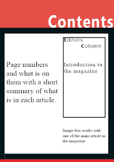
This is the flat plan for my contents page. I have slightly changed it from my original flat plan because in the editor’s column there isn’t going to be a picture of the editor. I think this is better because then the magazine will look more professional and not like a gossip magazine. I have made the box around the editor’s column black and thick so that it stands out and is made to look separate to the rest of the page. The black and red colour scheme has continued from the front page and would be continued throughout the magazine.

